新竹市圖書館識別及指標系統
Hsinchu City Library Identity and Signage Project
Brand Identity, Signage
客戶 Client | 新竹市文化局 Cultural Affairs Bureau, Hsinchu City
藝術指導 Art Director | 林天惠 Millie Lin
主設計師 Lead Designer | 黃新鈞 Jun Huang
設計師 Designer | 蘇佳星 Chia-Hsin Su, 林柏璿 Ethan Lin
專案管理 Project Manager | 萬鈺涵 Yuhan Wan
布章插畫 Patch Illustration | 蘇佳星 Chia-Hsin Su
印務統籌 Printing | 圓彩國際 Corona Technics
紙材 Paper | 源圓紙業 The Paper One
作品攝影 Studio Photography | 張國耀 Chong Kok Yew
Awards
2024 日本 Good Design Award
2024 金點設計獎 Golden Pin Design Award
丨設計獎標章 Mark Winner


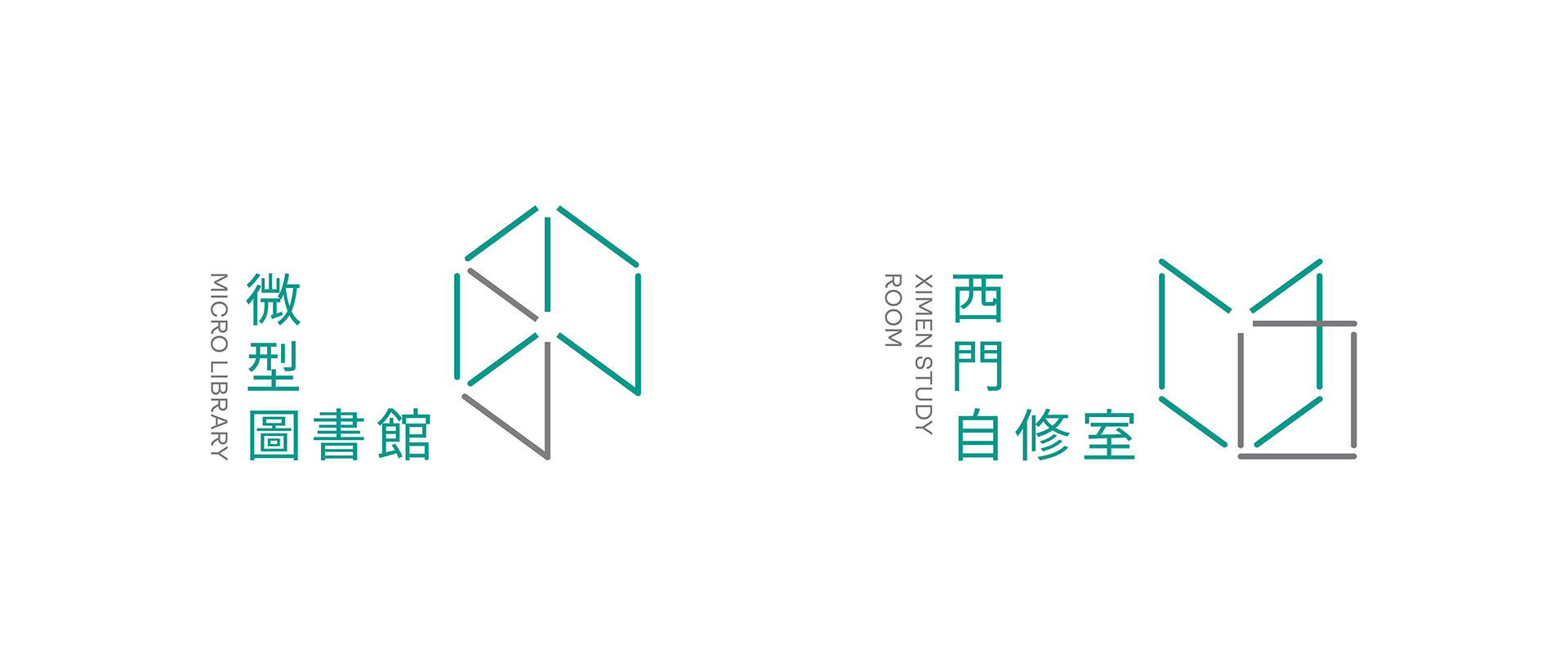
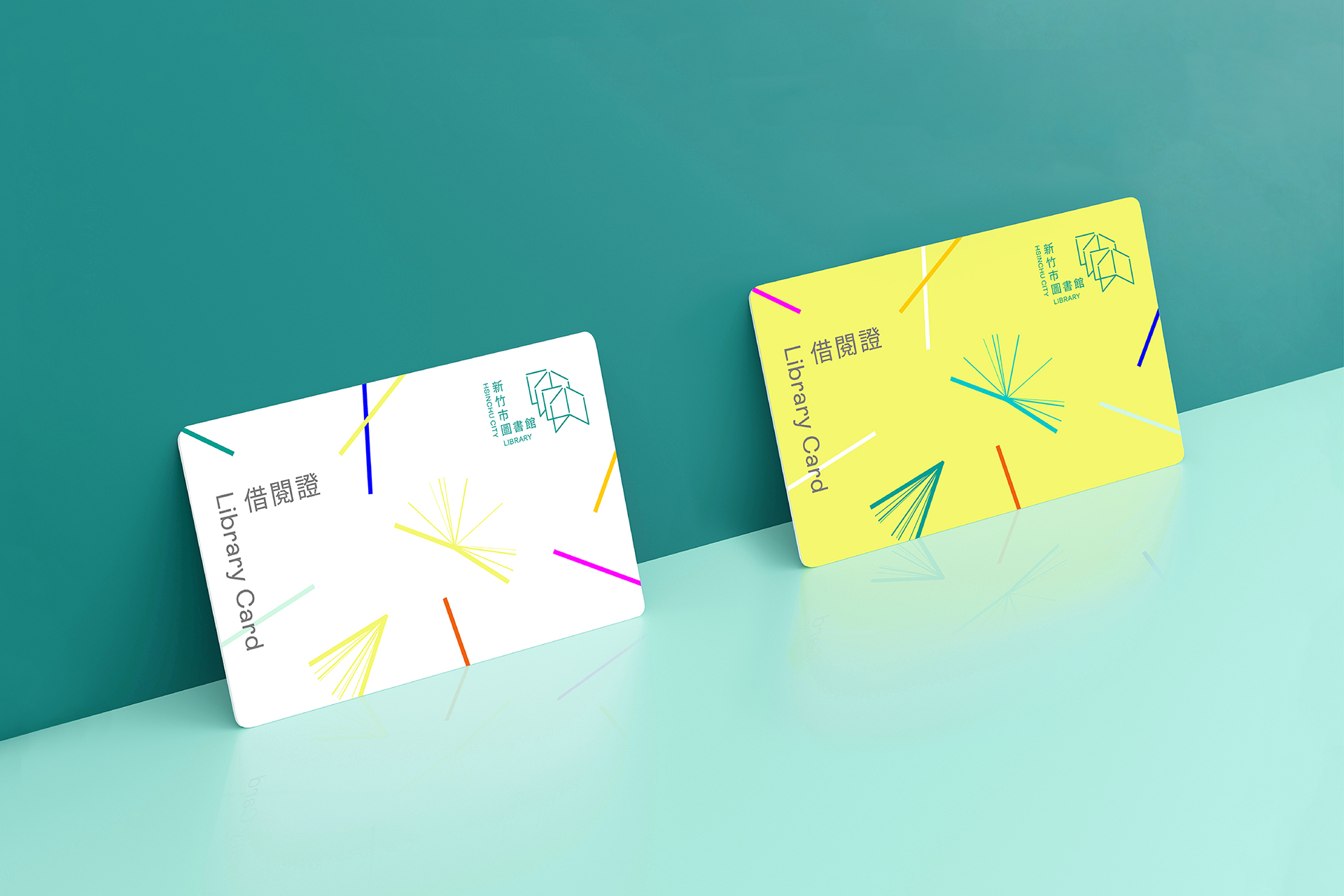
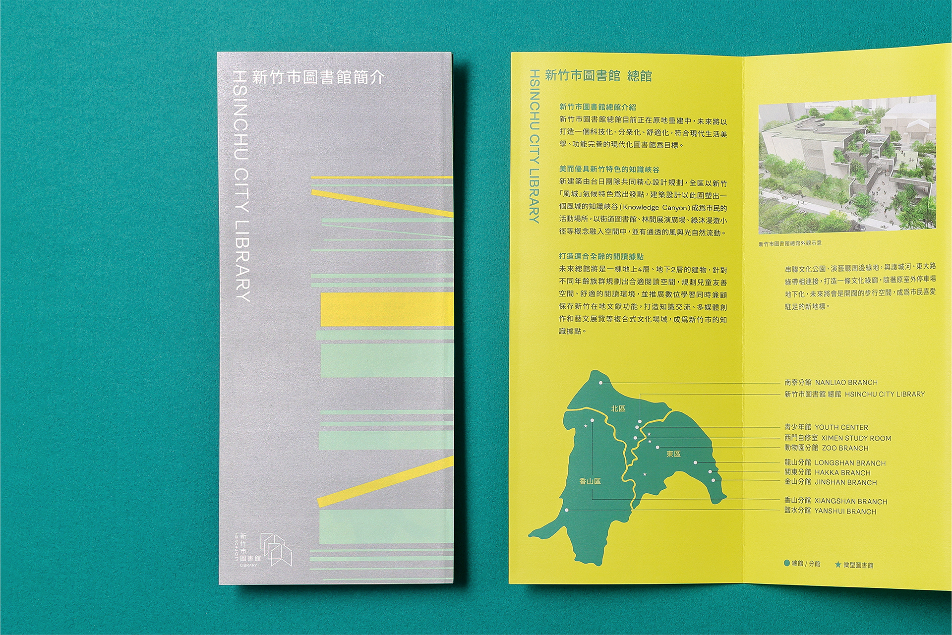
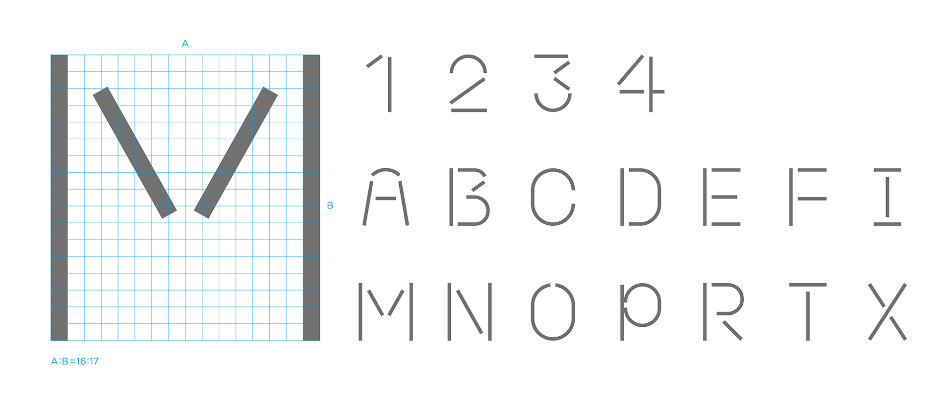
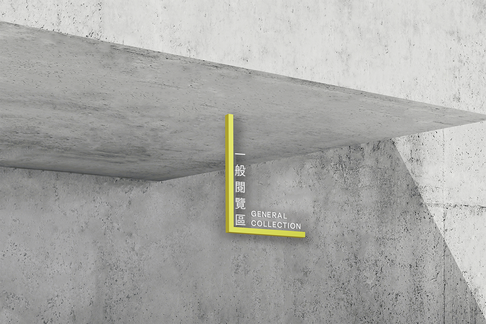
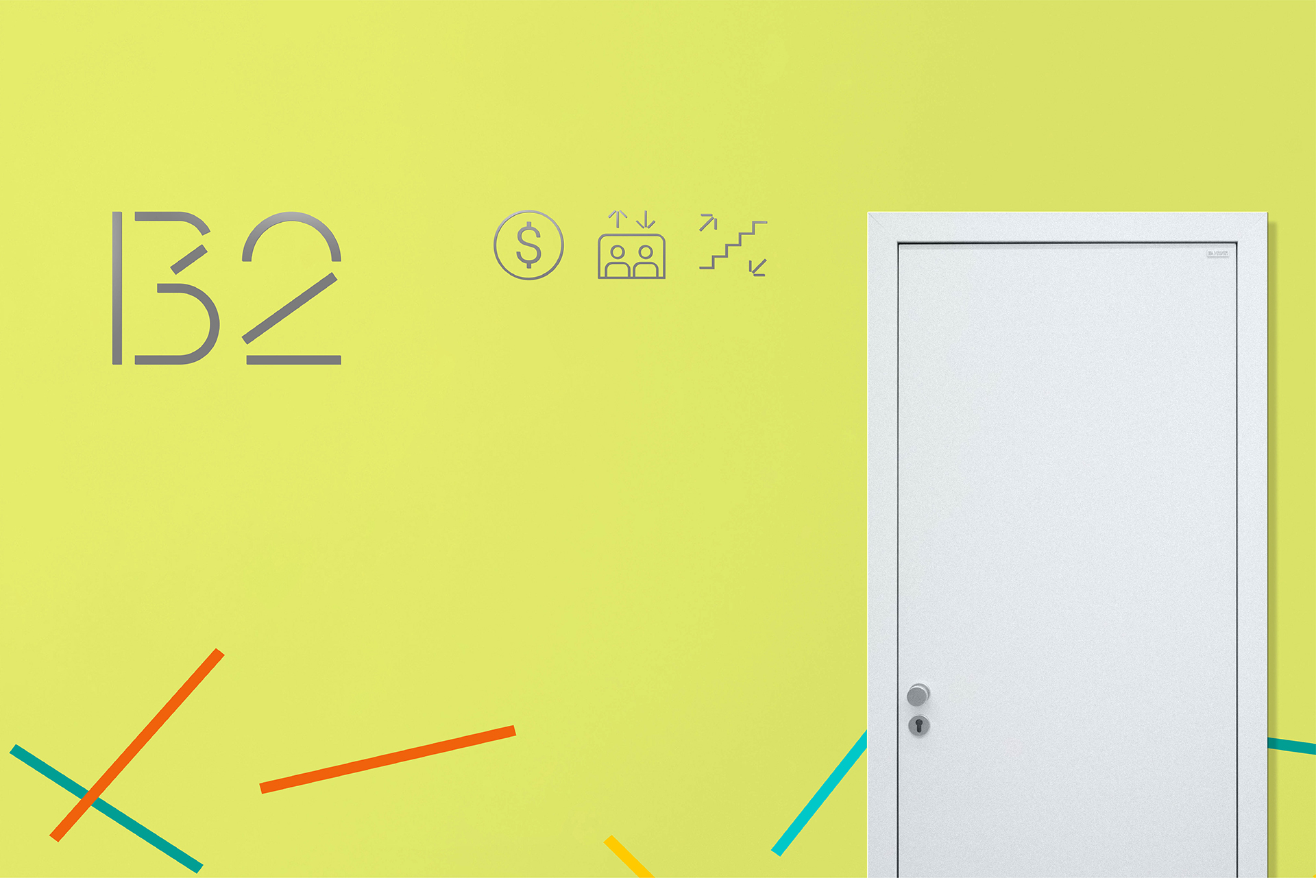
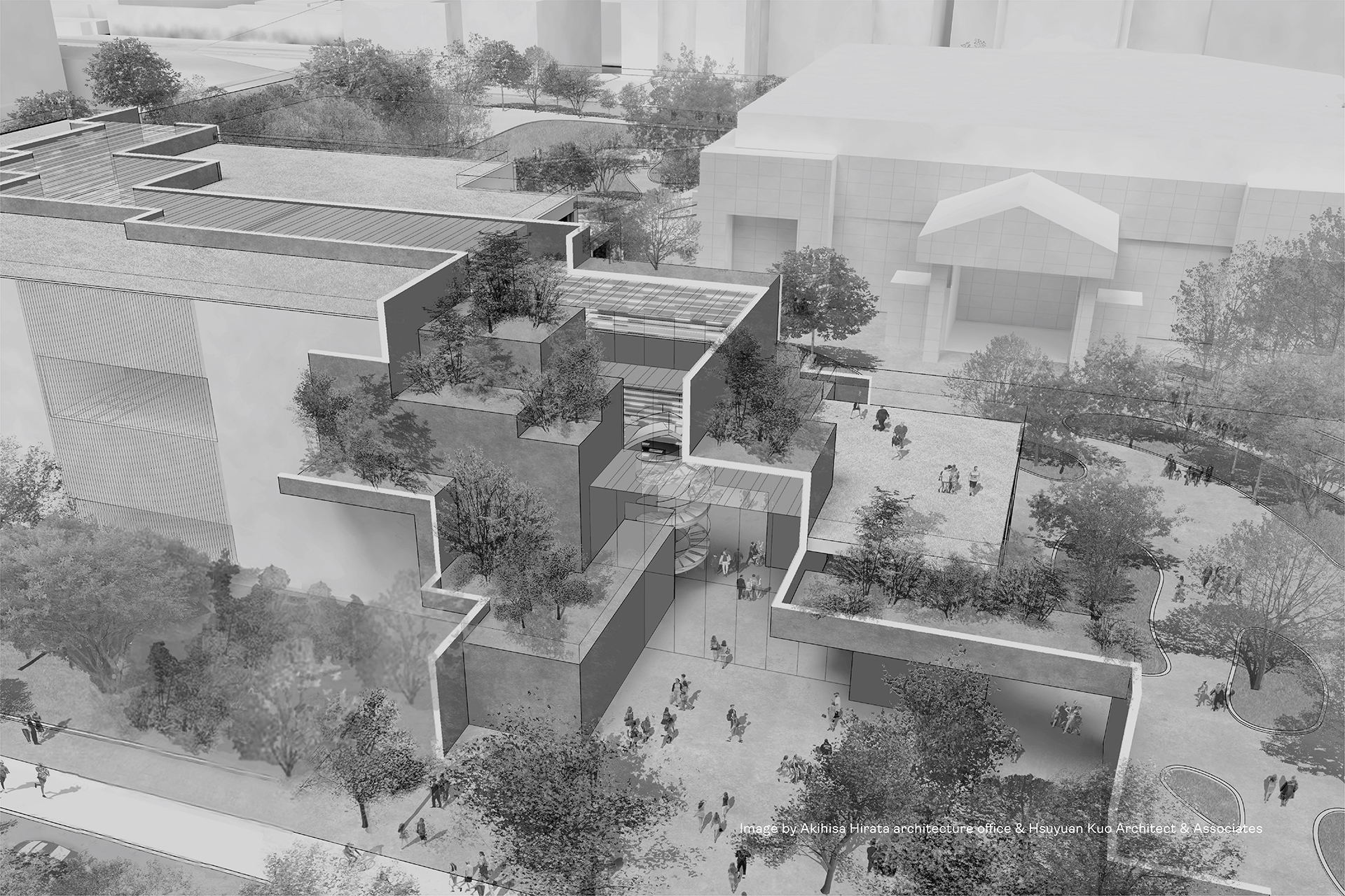
興建中的新竹市圖書館總館以知識峽谷為建築概念,因應改建計畫,希冀透過整體識別系統,將新總館與八個分館、自修室、微型圖書館串連,以 嶄新形象引介市民享受閱讀樂趣。標誌設計從「竹」字開展,結合書本、建築結構型態,線條間的開口則象徵對公眾開放與空間流動感。將標誌拆解後、線段自由交錯,似是於風中飄散翻飛、不同姿態的書冊作為輔助圖 形,帶出風城意象。在借閱證、館內公告、摺頁、簡報 / 網站版型、指標系統等變化出圖紋家族、並交互應用,讓整體形象更為多變完整。指標上的客製字體、icon圖標延續了線段開口特徵,標誌上的直角文字排列具體轉化為側招、L型空間標示等設計。指標設計單純以亮黃與灰的搭配,讓建築師規劃的彩色書架成為主角。為凸顯各館之獨特性,以區域重點發展及館藏特色製作刺繡布章,作為識別記憶和推廣之用,可與制服、帆布袋、或個人物品隨意搭配,邀請館員與讀者盡情發揮創意,讓閱讀走入日常、陪伴民眾穿梭於城市間。
The Hsinchu City Library Main Branch is designed as a knowledge canyon. We aim to connect the new branch with eight other branches, study rooms, and mini libraries through an integrated identity. The logo originates from the character for bamboo 竹 , and combines elements of book and architecture. The openings between the lines embody openness and spatial fluidity. Using the shape of a book as the basic unit, a dynamic identity is created through stacking arrangements, ensuring each affiliate shares a unified yet distinct image. Out of the color palette of Hsinchu's natural environment and technology industry, river green and neutral gray are adopted as the primary colors. The secondary colors are inspired by local cultural-historical landscape, with a highlight on Hakka heritage, conveying that the city embraces its legacy by fusing the past with the present, as it progresses toward the future. Reorganizing the line segments of the logo in a free, interlaced manner, we create an image that resembles book pages fluttering in the wind, instantiating the Windy City. These graphics are applied in library cards, brochures, presentation/web templates, and signage. The custom typography and icon graphics retain the characteristic of line opening. The placement of text at the right angle transforms into designs for side signs and L-shaped room signs. A combination of yellow and gray accentuates the colorful bookshelves in the library. To spotlight the individuality of each branch, embroidered patches are designed based on regional development and collection highlights, which serve as identifiers and promotional items. Each branch has its own distinctive patch. These fun products can be paired with any personal items at the creative disposal of their owner.

